JET Account Experience
Redesigning a legacy “Settings” page into a scalable, global “Account” experience that improved self-service and unlocked new monetisation features.
Team
Senior Designer (me), Senior PM, Group PM, multiple product teams
Impact
Helped reduce help centre calls by 8% through clearer help self-service and better information architecture.
Unlocked in-app Account credit and Just Eat Pay, supporting meal stipends and future payment product.
The challenge
The Settings experience had grown organically over several years, resulting in a cluttered and inconsistent interface that no longer met product quality standards.
Visual design was outdated and misaligned with newer patterns, reducing perceived quality and trust.
Incremental content growth led to poor hierarchy and low discoverability.
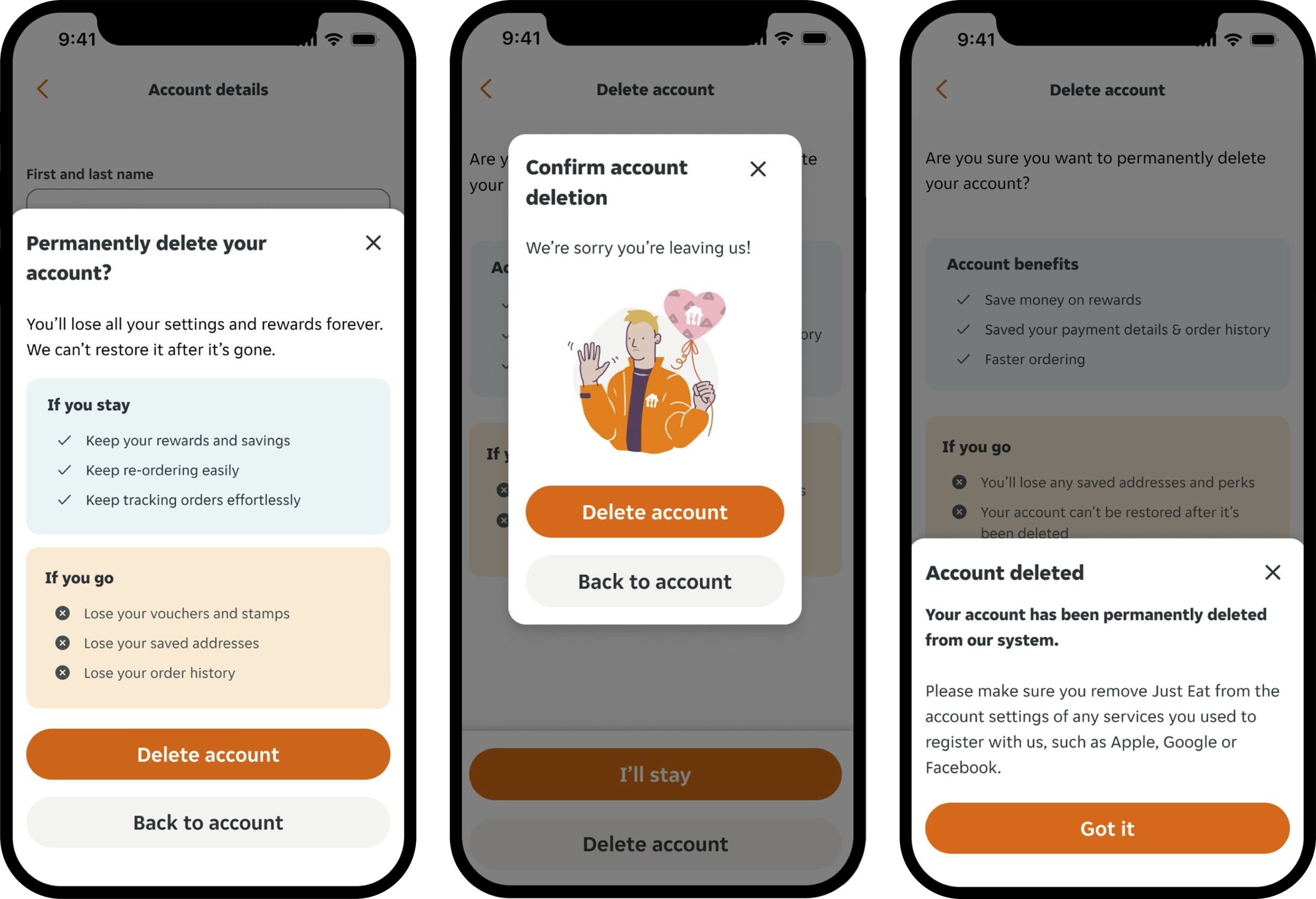
Logged-out and logged-in users had largely the same experience, including access to Delete account, which of course only makes sense when your have an account and are logged in.
Users in many markets could not manage key account features like personal details, payment methods, or account credit in the app.
Significant differences across platforms and countries created inconsistent experiences and increased complexity for users and teams.
The brief
Modernise Settings by updating the visual design, fixing the information architecture, and aligning capabilities across markets, platforms, and web vs app.
My role
I led design end-to-end across discovery, IA, concept development, testing, and iteration, while also shaping the direction of the problem itself.
In addition to execution, I:
Challenged the initial scope and pushed the brief beyond a visual refresh.
Partnered closely with Product to reposition Settings as a broader Account experience.
Balanced user needs, technical constraints, and business priorities across multiple teams.
Used data and research to align stakeholders around a more ambitious, but achievable, direction.
Discovery and insights
User behaviour and feedback
We reviewed both qualitative and quantitative data already available, drawing on sources including Chattermill and product analytics. This helped us shape early direction.
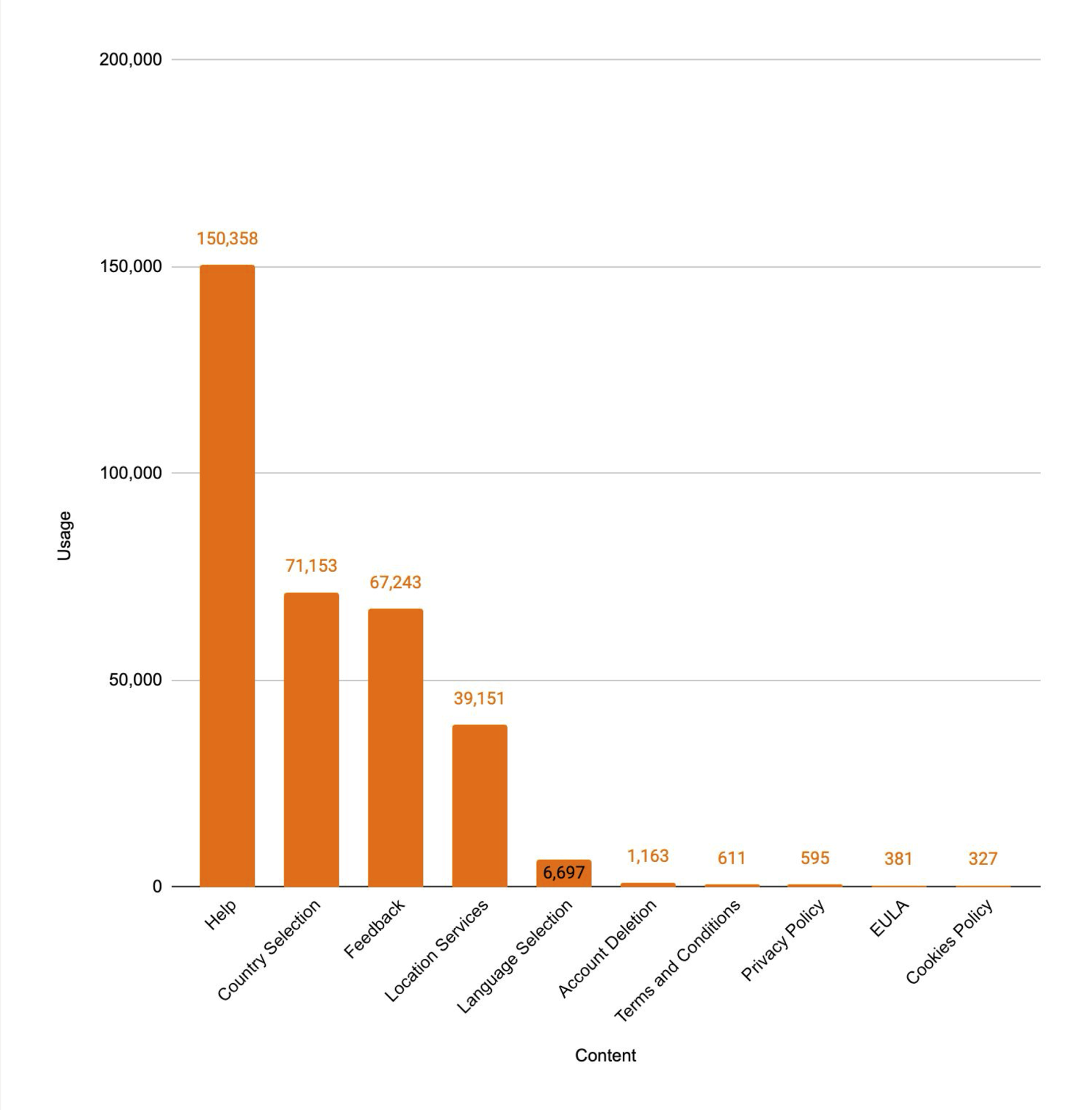
Usage data showed that only a small number of Settings items were frequently used, with “Help” accounting for the majority of interactions.
Customer feedback consistently highlighted frustration around managing account credit and payments, especially on mobile.
Guest checkout users were less likely to return than logged-in users.
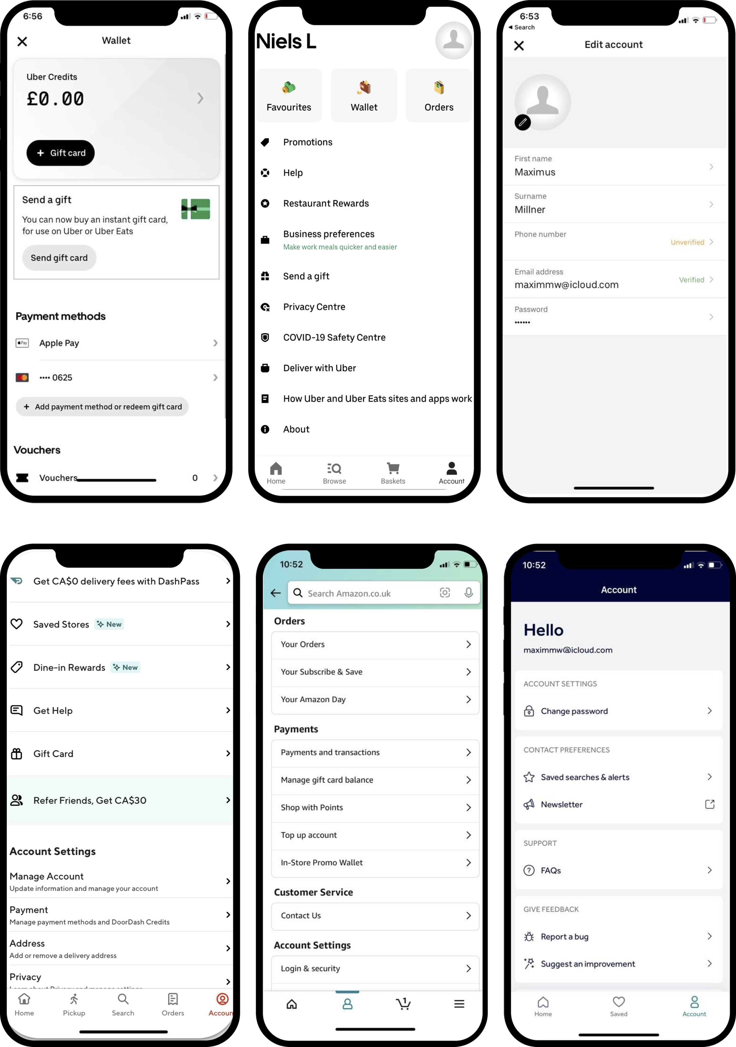
Competitor landscape
We reviewed how leading products such as Amazon, Uber Eats, and Rightmove structure their account and settings experiences. This surfaced clear patterns to adopt and avoid.
Adopt
Account-related features are grouped within a dedicated Account area.
Payment methods, addresses, and personal details are easy to find and edit.
Logged-out states are clearly differentiated and used to encourage sign-up.
Avoid
Long, unstructured lists with little hierarchy.
Inconsistent use of “Profile”, “Account”, and “Settings”, often used interchangeably or nested confusingly.
Settings content mixed into account or profile pages without clear ownership.
As a result of discovery, I proposed expanding the brief and reframing Settings as a dedicated Account experience, rather than a standalone utility.
This shift allowed us to:
Align the experience with established user expectations and mental models.
Consolidate Settings within Account, removing the need to dedicate a core navigation item solely to Settings.
Create a scalable foundation for future account-related features without fragmenting the experience.
Support business priorities, including encouraging account creation.
This reframing became the foundation for both the new information architecture and the visual design direction.
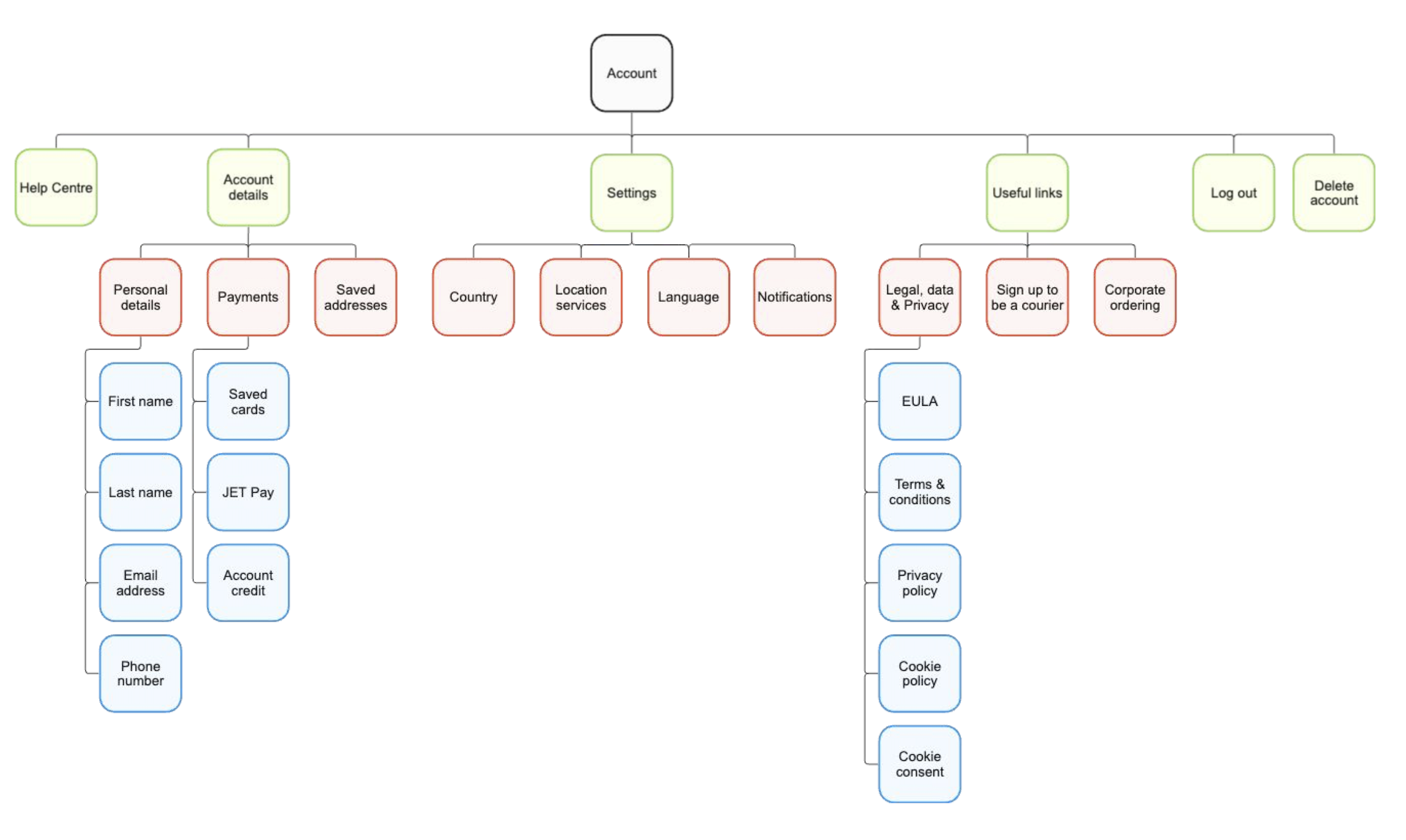
Information architecture
I designed two distinct structures:
Logged-in experience
Strong priority of help in the experience
New access to account management features including personal details, payments, saved addresses, saved cards, account credit and JET pay.
Clear grouping within the Account page, of Account details, Settings, and Useful links to contain legal information.
Destructive actions only available when logged in.
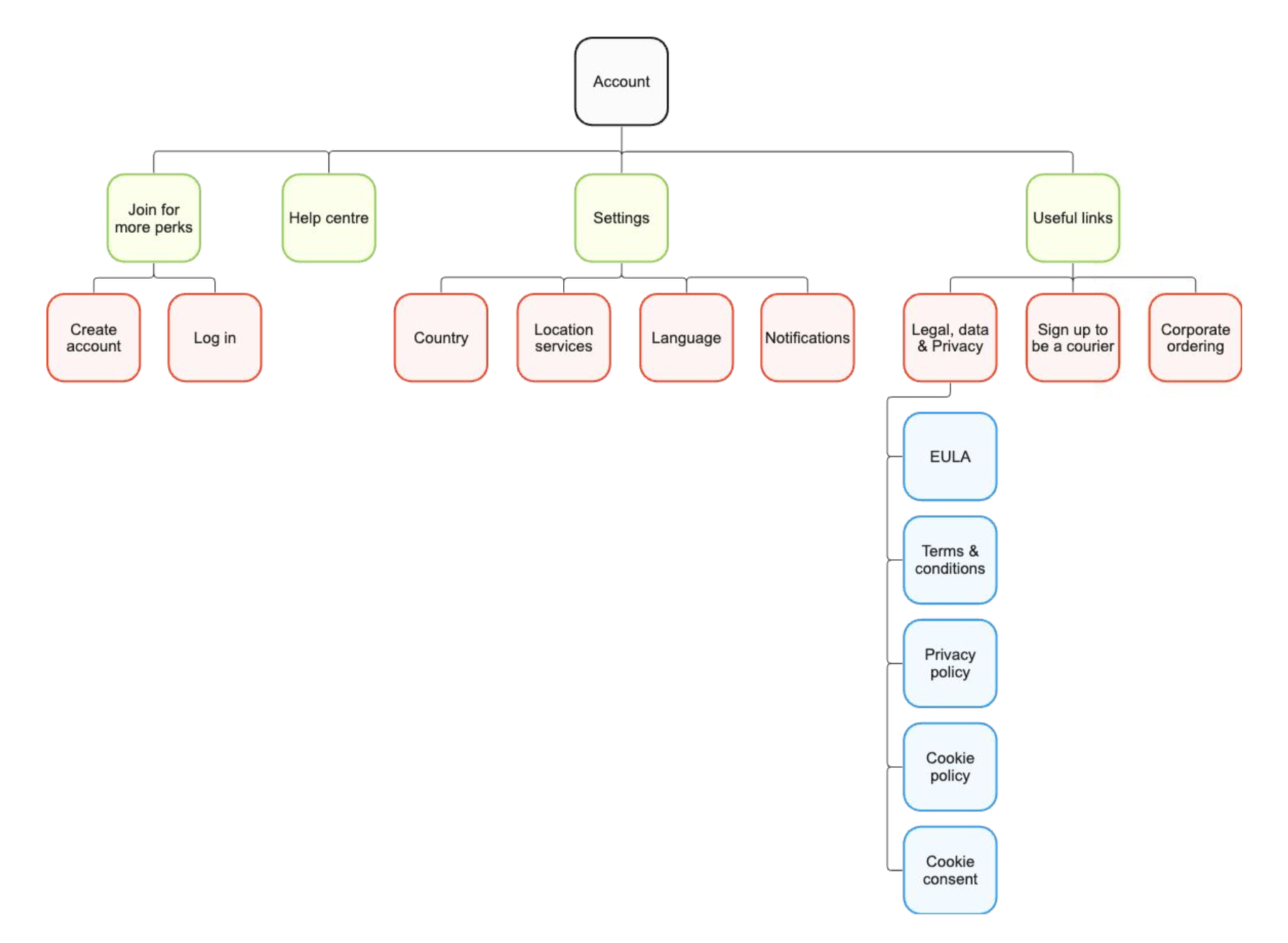
Logged-out experience
Prominent sign-in and account creation prompts.
No access to account management features.
Help prioritised.
Clear differentiation from the logged-in state.
Design exploration
Before converging on the final direction, I explored a wide range of concepts. This exploration intentionally included ideas that were out of scope for the initial release, to help define a clear north star and inform a more considered iteration strategy.
Exploration covered:
Personalised messaging, including time-of-day variations.
Live order visibility surfaced within the Account experience.
Alternative navigation patterns, including both tabbed and list-based layouts.
Marketing surfaces such as carousels for courier sign-up.
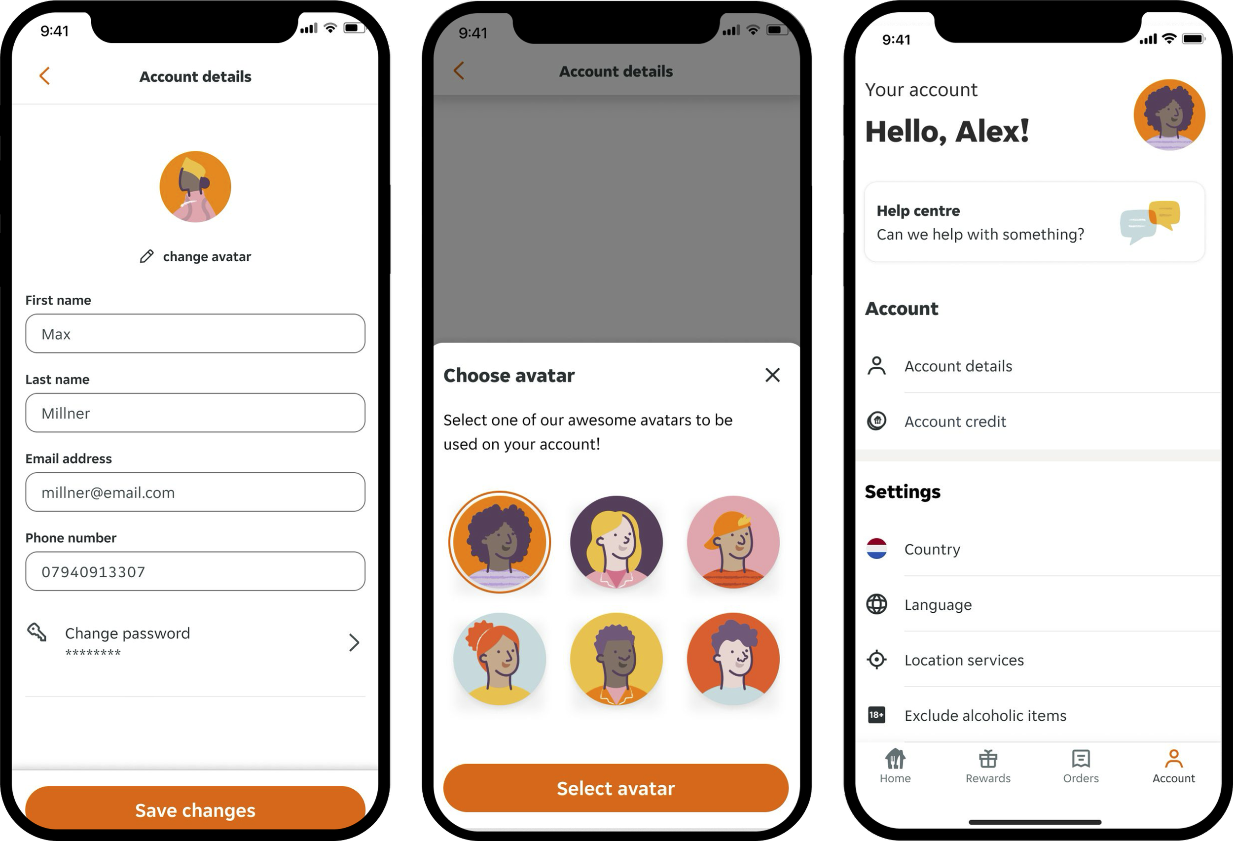
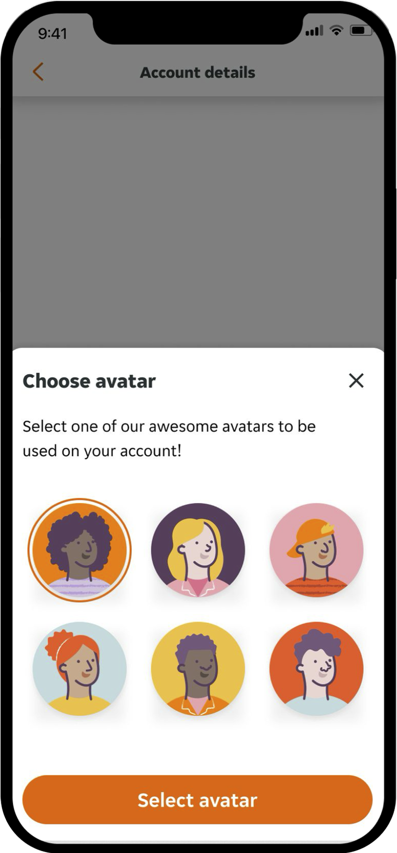
More experimental concepts, including a “choose your avatar” experience.
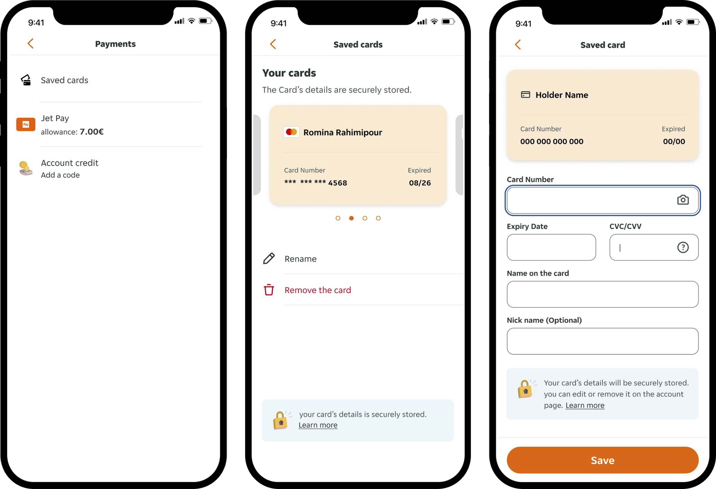
I also went deeper into several of the proposed experiences, partnering closely with the Payments team to explore how a fully integrated payment management experience could live within Account.
In parallel, I redesigned the delete account flow to better communicate the value of keeping an account, while still preserving full user control and transparency over irreversible actions.
User research
I ran unmoderated usability testing with 8 participants across iOS and Android, using the Account page direction the team had aligned on.
The research focused on validating core assumptions:
Whether the new information architecture was understandable and the sections felt logical.
Whether renaming the section to Account and placing it in the bottom navigation made sense.
Whether surfacing Account credit within Account met user expectations.
How easily participants could find Help.
How participants responded to the experimental avatar concept.
Key findings:
The new Account section felt “natural”, “clear”, and aligned with user expectations.
Most participants instinctively navigated to Account to manage account credit.
Participants also instinctively went to Account to find Help, and its prominent placement was consistently appreciated.
The avatar concept was perceived as low value and unnecessary.
As a result of these findings, we felt confident moving forward with the Account model and made the following decisions:
Committed to the new information architecture and the renaming of Settings to Account in the core navigation.
Positioned Account credit and Help as primary elements within the experience.
Removed the avatar concept from scope, allowing the team to focus delivery on higher-value account features.
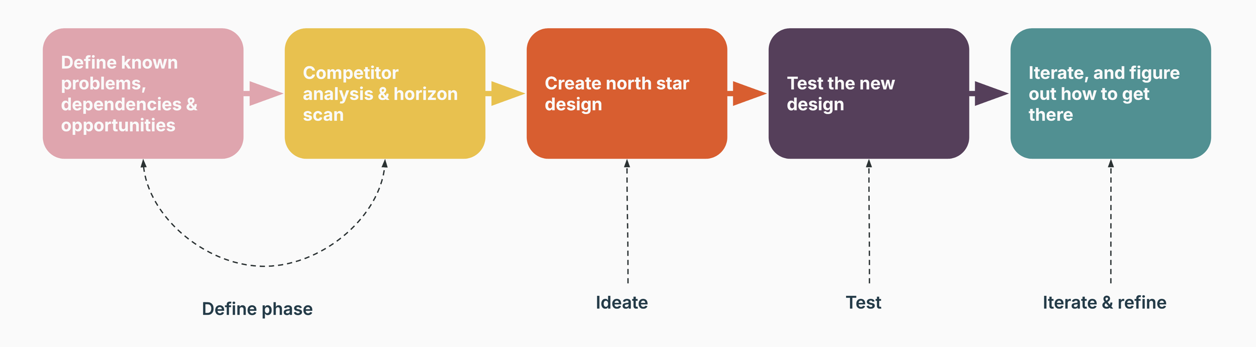
Iterate & refine
Following research, I worked closely with Product and Engineering to define scope for the first iteration and agree what should be deferred to future releases.
Given engineering capacity and delivery constraints, we made deliberate trade-offs. The fully integrated payments management experience and the redesigned delete account flow were deprioritised for iteration one, with a clear plan to revisit them in later phases.
For the initial release, we prioritised:
Establishing the new Account UI and information architecture.
Elevating Help as a core, easily discoverable part of the experience.
Integrating Account credit and JET Pay into Account, addressing a key customer pain point.
Creating a scalable foundation that could support future account-related features without rework.
This approach allowed us to deliver meaningful user and business value early, while maintaining a clear long-term direction.
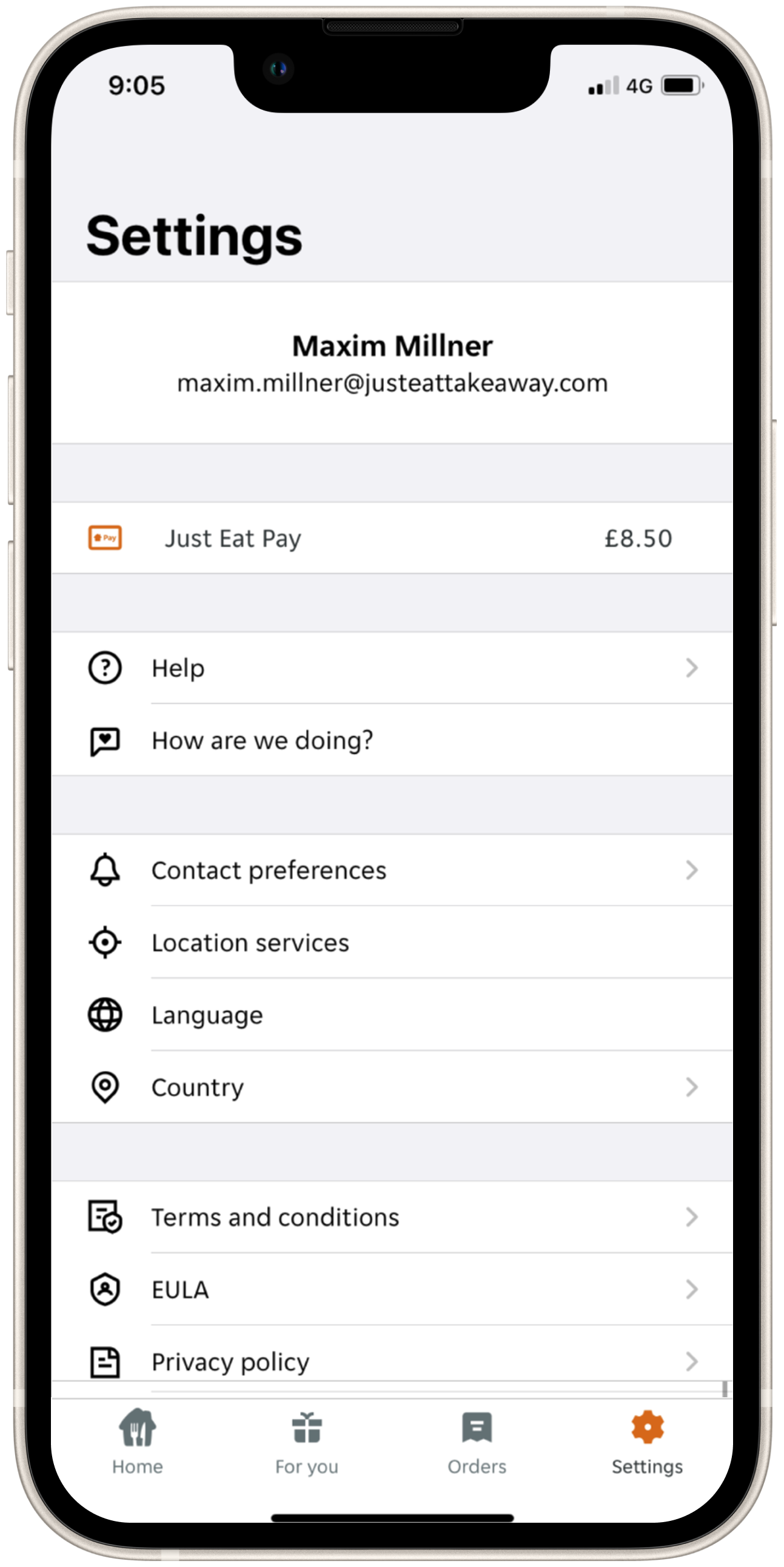
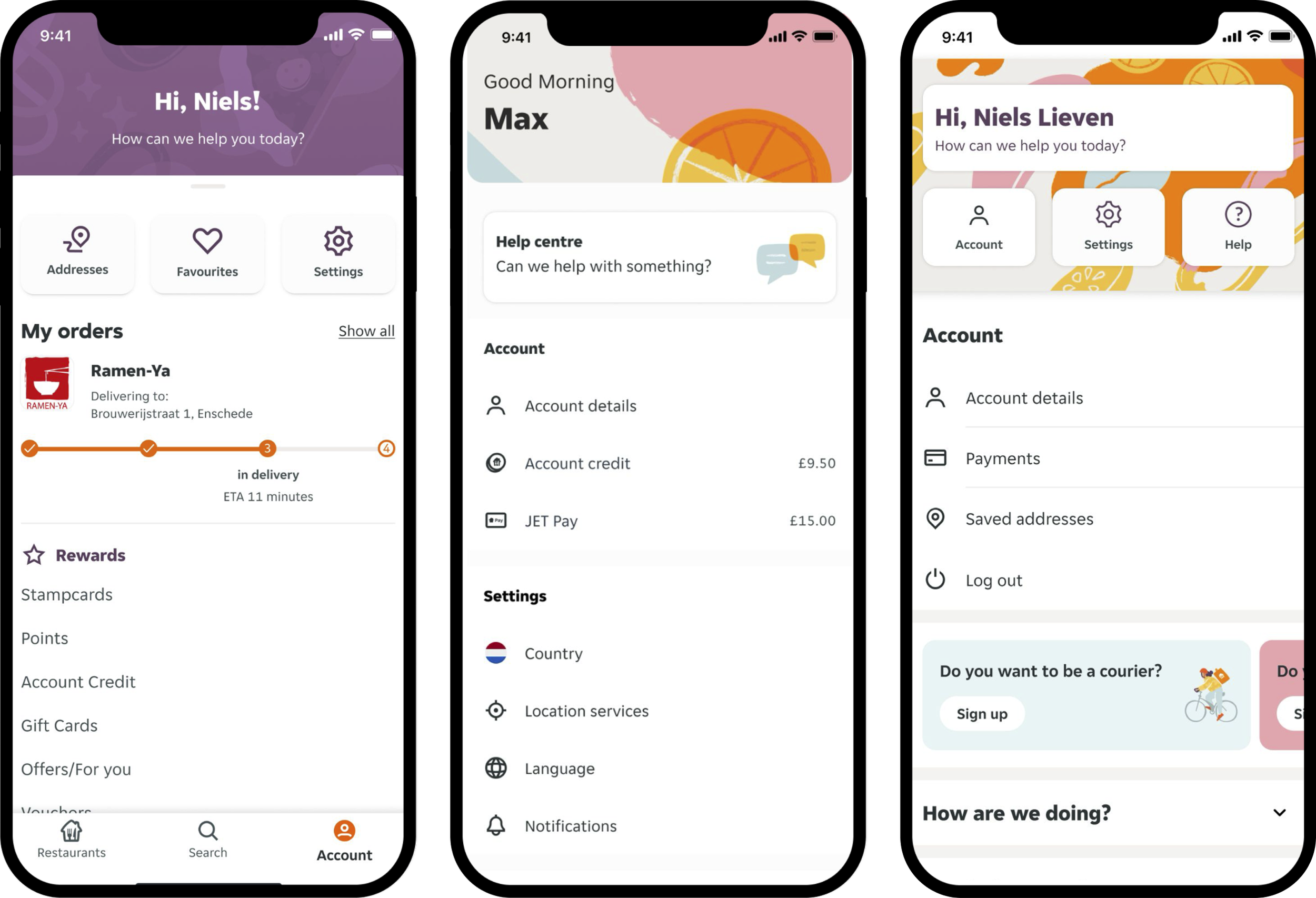
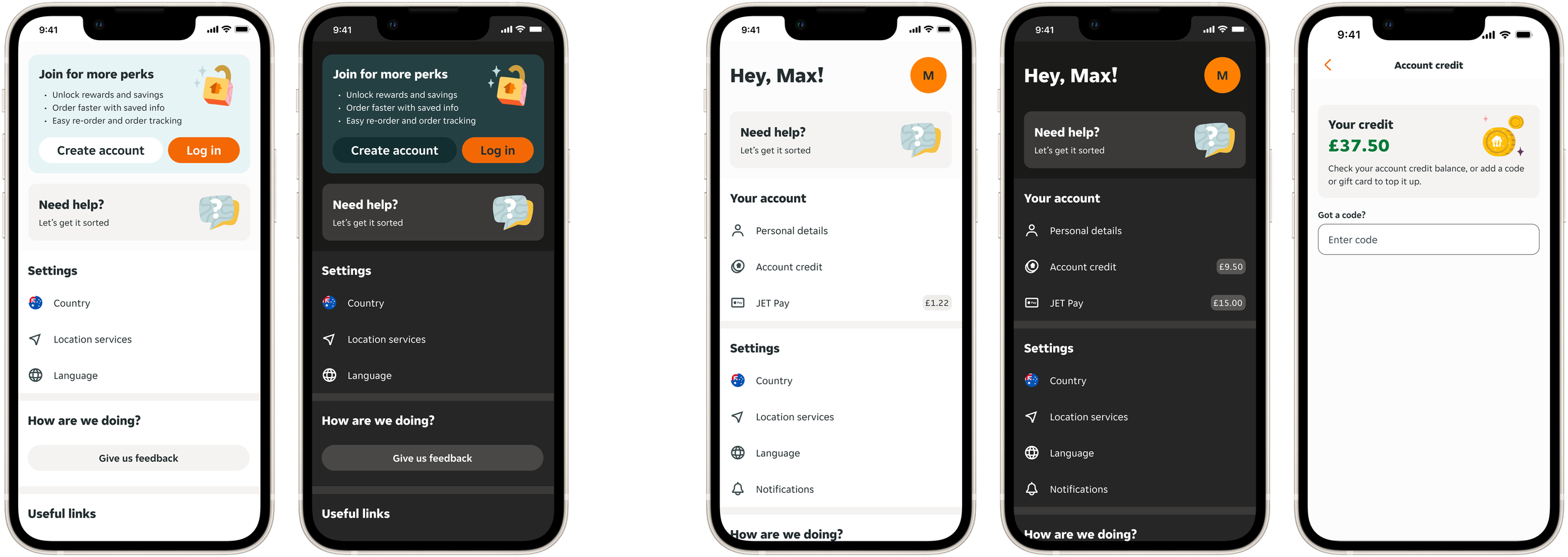
What we shipped
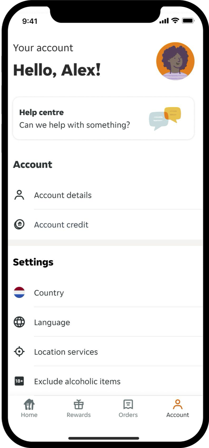
A modern, Account experience was shipped globally, with a new UI and information architecture, and clearly differentiated logged-out and logged-in states.
Logged out
Clear entry point at the top to encourage account creation, supporting business priorities.
Help prioritised to reduce friction.
Simplified information architecture with clear section headers.
No “Your account” section, only Settings-level content.
Removal of destructive actions such as Log out and Delete account.
Logged in
Personalised Account experience, including name and initial.
Account credit introduced, with JET Pay integrated into “Your account”.
Help prioritised and easy to find.
Destructive actions available.
Project outcomes & learnings
This project demonstrated the value of stepping back from incremental redesigns and challenging the framing of a problem. By prioritising Help within the experience and placing it within a clearer information architecture, the work contributed to an 8% reduction in Help Centre calls.
By pushing the brief, we moved from refreshing a legacy Settings page to defining a scalable Account experience that better served users, supported business goals, and created a stronger foundation for product teams.
The project reinforced the importance of:
Using data and research to reframe problems, not just validate solutions.
Challenging “MVP” thinking when it limits long-term quality and coherence.
Designing for user mental models rather than existing product structures.
Being willing to remove ideas that do not deliver clear user value.